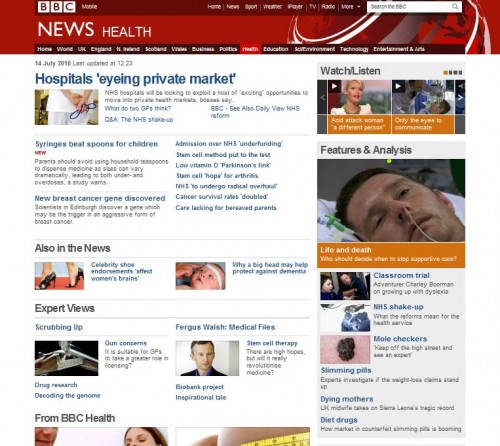
BBC News is looking extremely sleek today. At first I thought I was on the wrong page! I always read their Health News pages and today was pleasantly surprised by the vibrant and modern new look.
The BBC have decided to remove the old fashioned left sidebar and now have all their navigation along the top of the page. The right hand side shows features, most popular news of the week and also has relevant links to video material on iPlayer.
They have provided a guided tour of their new layout which helps to explain where things are and why they have moved. The design aims to be cleaner and provides more space for better quality pictures and videos.
Alongside each story they now show other relevant stories. Each video page displays a better quality and larger video with links to other videos. This will possibly revolutionise the way the BBC share its news content.
They are now provide social networking links to that we can share the news easier with friends and family. Well done BBC! Right, now time for a Webologist.co.uk makeover!


