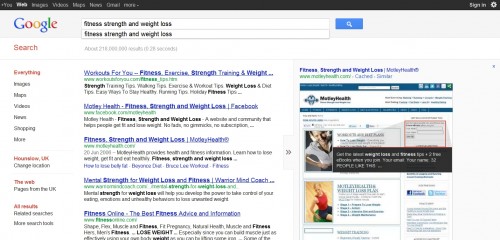
Just seen a new Google search results layout. Rather than the traditional view with the the “cached” and “similar” links below the description snippet, now you click a big grey arrow to the right of the result to open up the preview which then has the extra details too. This all covers up the right hand adverts, so the preview is bigger.
I like it, it looks neat and clean. Refreshing to see a page on Google search with no adverts on it too. I wonder what else Google have planned though. Sure this must just be a transitional view or a test. It is too uncluttered at the moment!
An example:

